Joel Hague is an artist, curator and researcher based in Scarborough, North Yorkshire.
Joel is interested in letterpress and the preservation and welfare of type heritage and exploring ‘print’ as a queer mode of making. Joel takes a process-led research approach to their practice, observing the technical and social investigation of print, through curating, archiving and making.
How would you describe your practice, and what have you been working on in the Riso room?
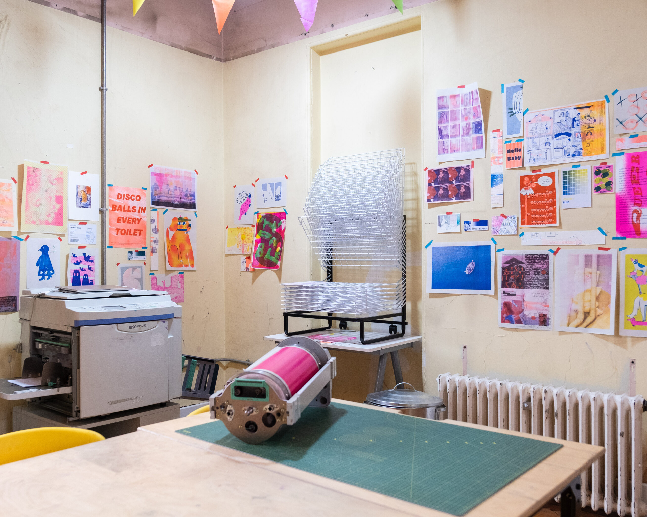
Predominantly, I’m a letterpress printer. Currently, I’m researching two things at once: learning about the role of a printmaking technician and exploring the means and medium of queering letterpress.
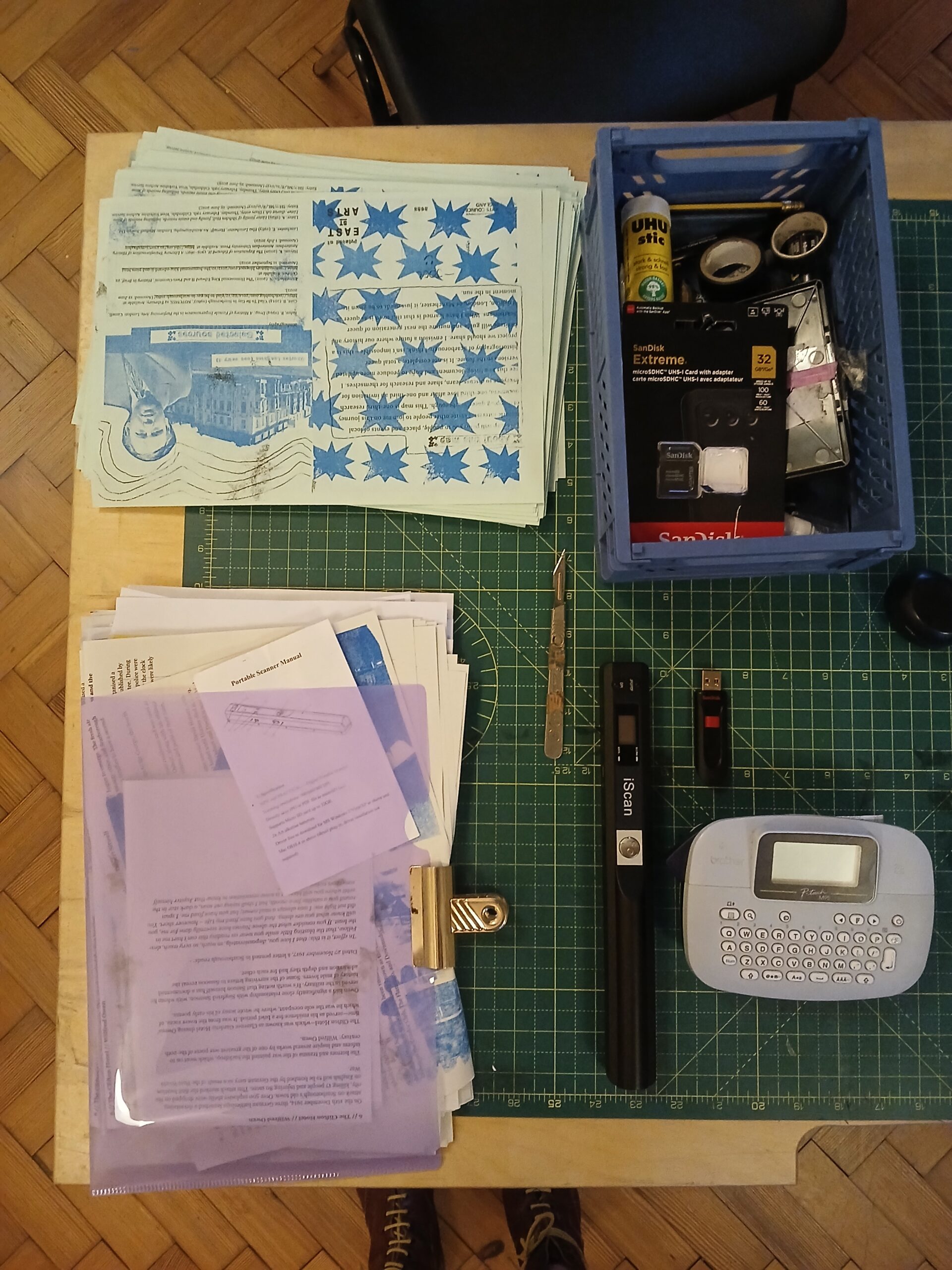
But I am interested in printmaking as a whole, and riso has always had a place in that. My main goal has been to finish ‘An Ongoing Queer Map of Scarborough’, which plots a few of the interesting people, places and events on Scarborough soil. That and I had a bunch of ideas and a few finished sketchbooks to play around with!
Describe Riso Printing in three words
Unpredictable, curious and imperfect.
Which part of the creative process in Riso printing inspires you the most?
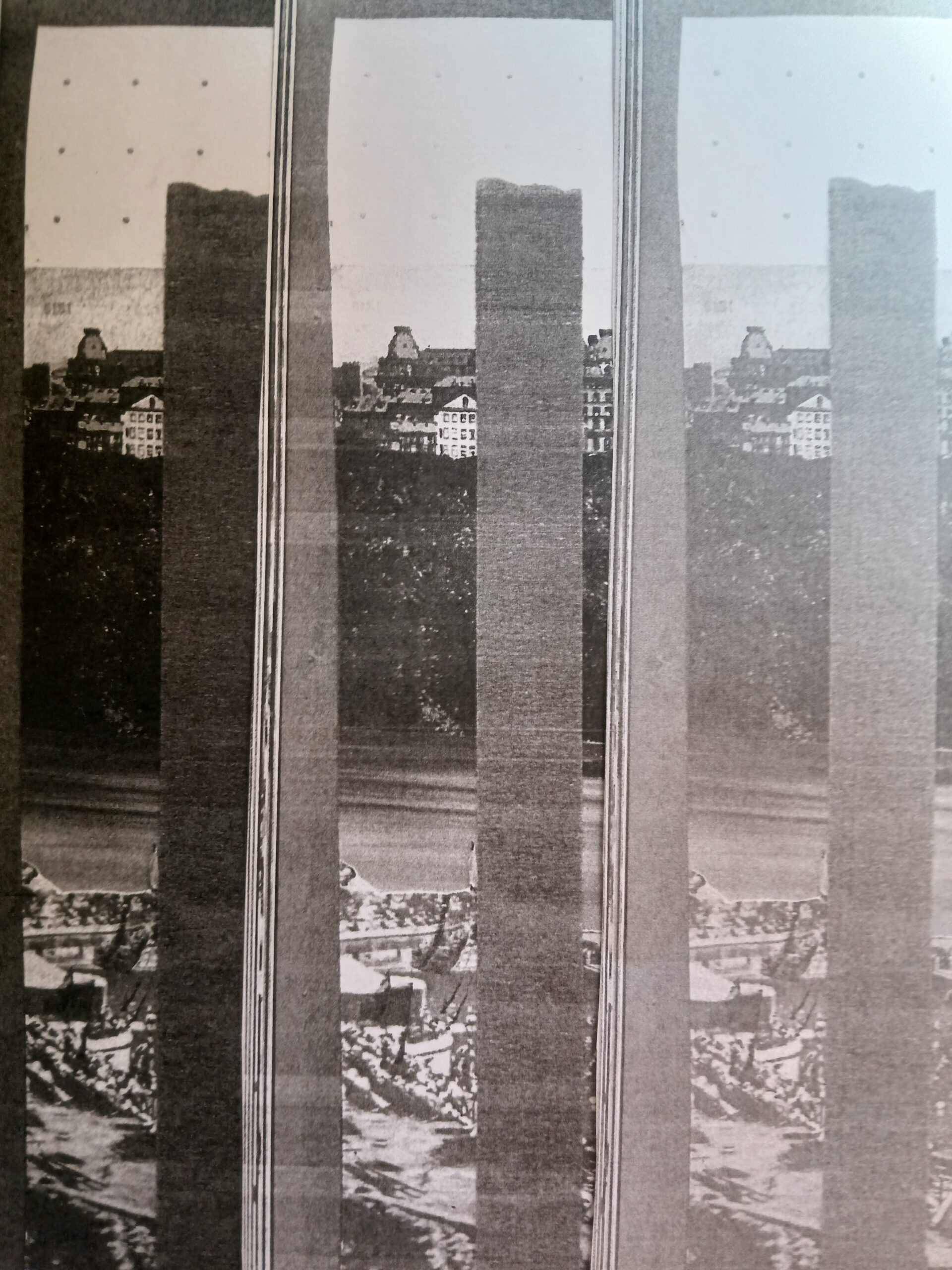
For me, it’s how quick and instant it is. I love just drawing something in the moment, then throwing it into the scanner and just seeing what the outcome is. I quite like methods of making where misprints and errors are excusable due to technological limitations, which is why I like printing so much.
If you could only use two colours, what would they be and why?
Fluorescent pink is a classic; you can’t go wrong! I think, because it’s such a striking colour.
My new favourite might be teal, I think it’s a pretty versatile colour. But it’ll be different by next week.
Has your time in the risograph room changed how you work or think?
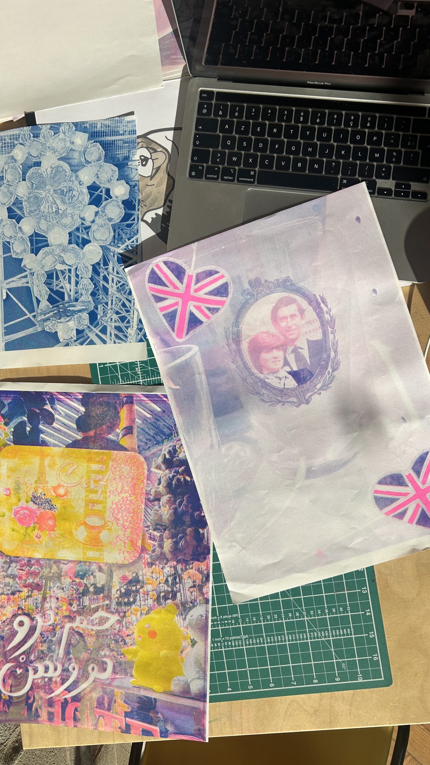
Well, between graduating and the residency, I’d only been given access to a risograph once during a workshop at Dizzy Ink in Nottingham, so I was a little rusty. But I’ve learnt so much about them now, including a few things I didn’t know previously. I used to spend a lot of time experimenting with the principles of CMYK printing when screenprinting, and the residency gave me a chance to do that with riso this time. It’s encouraged me to revisit the CMYK processes, breaking down images into channels, adjusting the colours, and then reassembling them.
What piece of advice would you give to someone who wants to start using Riso?
Have fun, try everything, and don’t be scared of the actual printers; they’re bound to go wrong with a paper jam or two, even in the most technical hands. And also, don’t expect your prints to come out the way you imagined them; risographs have a mind of their own.
Find Joel:
Website: joelhagueartist.wordpress.com Instagram: @_cheshur_

