Feryel Kaabeche is an artist based in Paris, using installation, graphic design and print.
After a bachelor’s degree from the Beaux-arts de Paris, Feryel Kaabeche developed a hybrid practice combining video, graphic design and installation. Her funny and sweet universe, saturated with colours, nourished by both internet culture and her Algerian heritage, claims a deliberately kitsch and overloaded aesthetic. Her practice reuses and diverges images always offset by a lot of irony: from this reappropriation are born new representations. Through her works exhibited at the Corvée, the Jean Collet municipal gallery, the ArtCade gallery in Marseille, and soon at the Louvre Museum, she aspires to create a common space of references and representations that meets an urgent need, far from the colonial gaze. She participates in many publishing fairs throughout France, including at Frac Marseille, the Agès B bookstore and more recently at the Palais de Tokyo. Devoted to evolve in these spaces, she took over the head of the Saint-Germain des prints association in 2024.
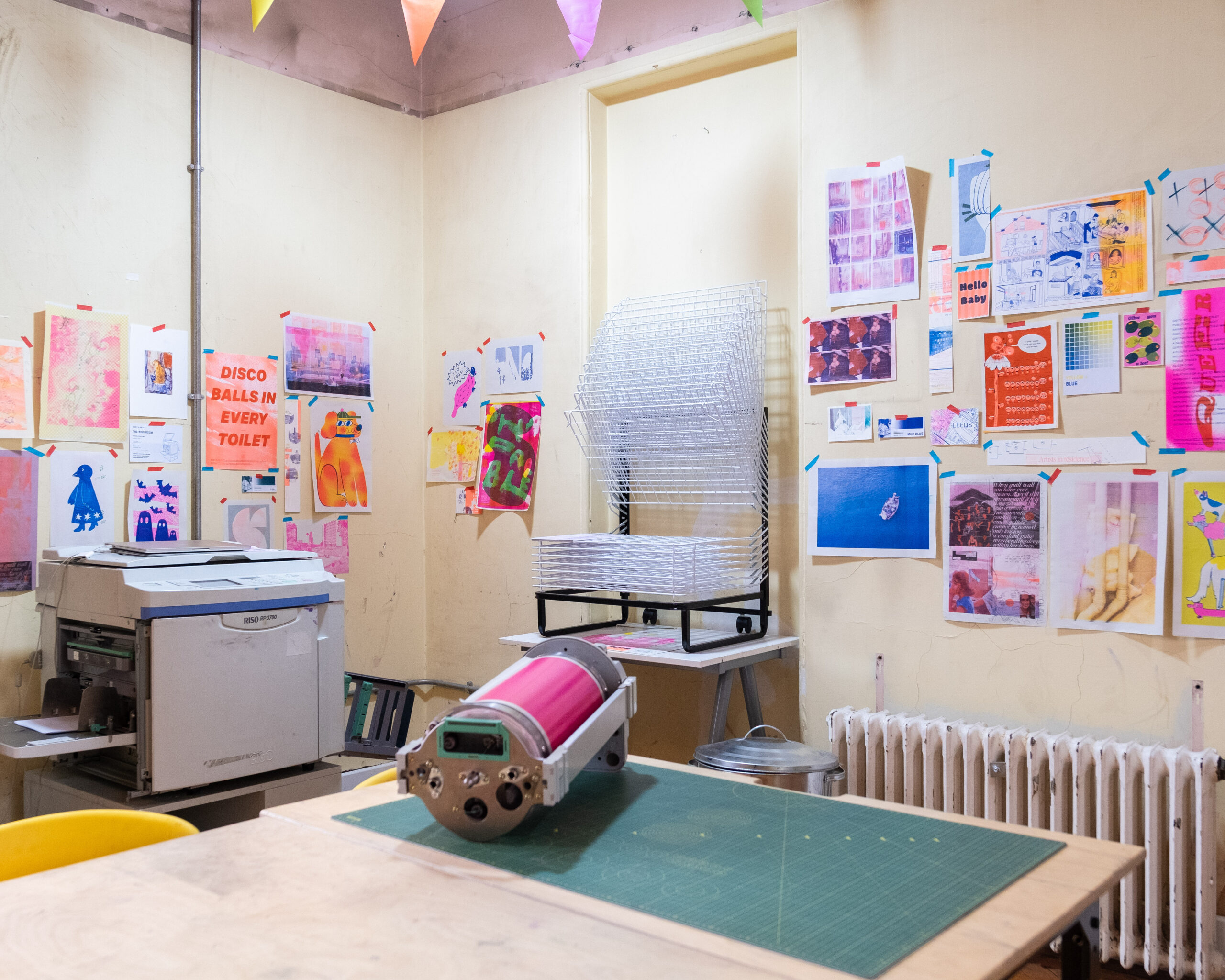
How would you describe your practice, and what have you been working on in the Riso room?
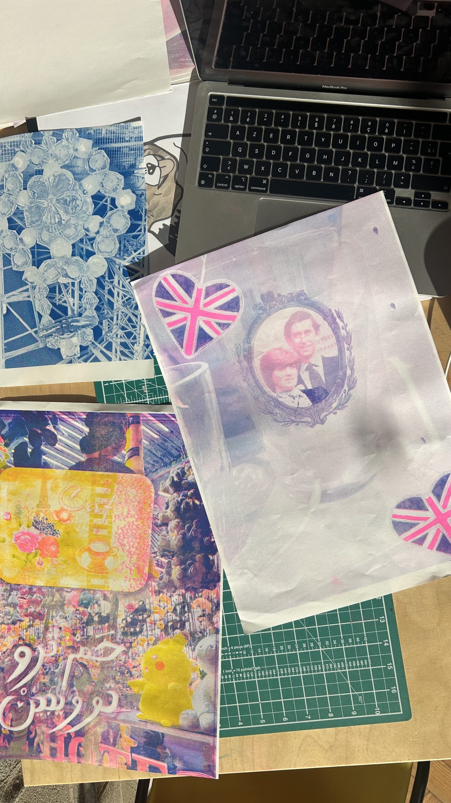
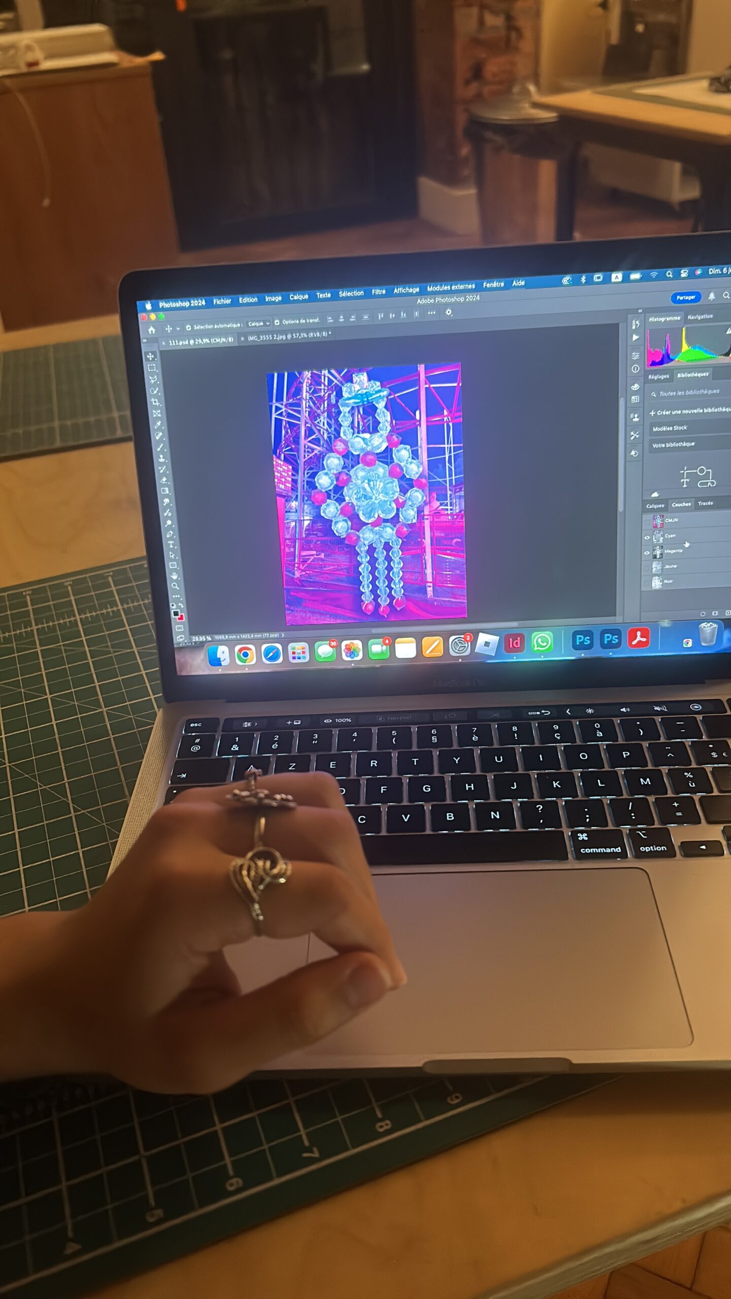
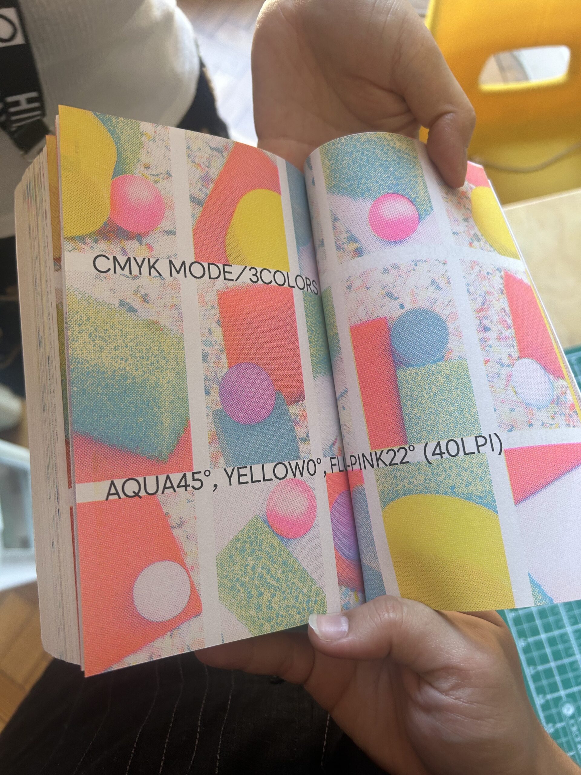
My work is about the kitch from a maghrebian scope. I am interested in diasporic aesthetics and their adaptation in Western countries. I collect images, without placing a hierarchy on their pictorialities. After an instinctive and spontaneous mixture of these images, I put them together in a collage, then choose the most interesting colour dominances to print them in riso. I worked with images from my personal collection documenting my life in France to which I added photos taken in Leeds during my stay.
Describe Riso Printing in three words
Challenging, stubborn but gratifying.
Which part of the creative process in Riso printing inspires you the most?
I particularly enjoy the planning of colors and how they will look mixed together on paper because while print testing it can look a lot differently than planned. It’s so stimulating to experiment with the machine, every time a new print is made feels like a surprise.
If you could only use two colours, what would they be and why?
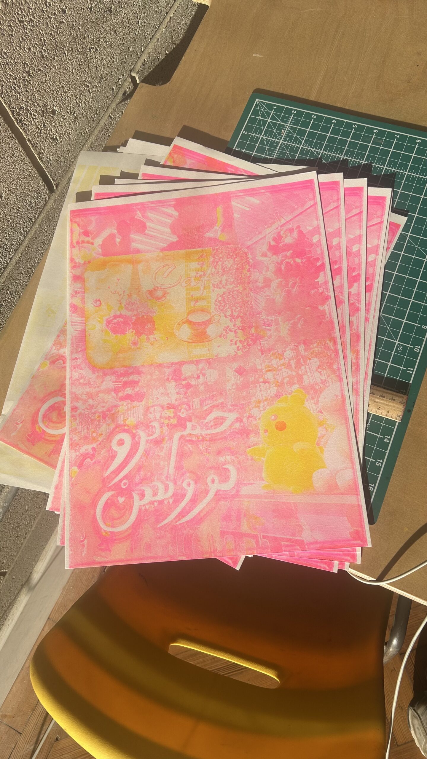
I would use fluo pink and green wich are my color of choice whenever I want a highly contrasted image. It’s also the main colors that I love to find around me especially in Algeria, my country of origin.
Has your time in the risograph room changed how you work or think?
My time in the riso room has been rich in prospection and experimentation. Being used to a fast paced environment in Paris, I was pleased to have some time to reflect and a space to work in my own timeline.
It inevitably changed my thinking process by not seing Riso as a mean of mass production but more as a tool for artistic expression.
What piece of advice would you give to someone who wants to start using Riso?
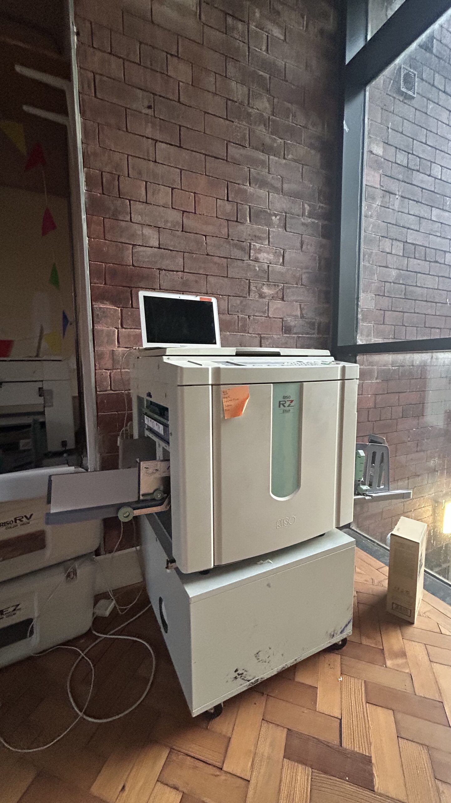
The Riso printer is a capricious creature that needs patience, gentleness and problem-solving capacities. You can’t be too demanding or a perfectionist because she (the machine) sometimes does whatever she wants. Breathe, don’t panic, take your time and everything will be alright.
Find Feryel:
Instagram: @fee.reel
Want to start riso printing?
