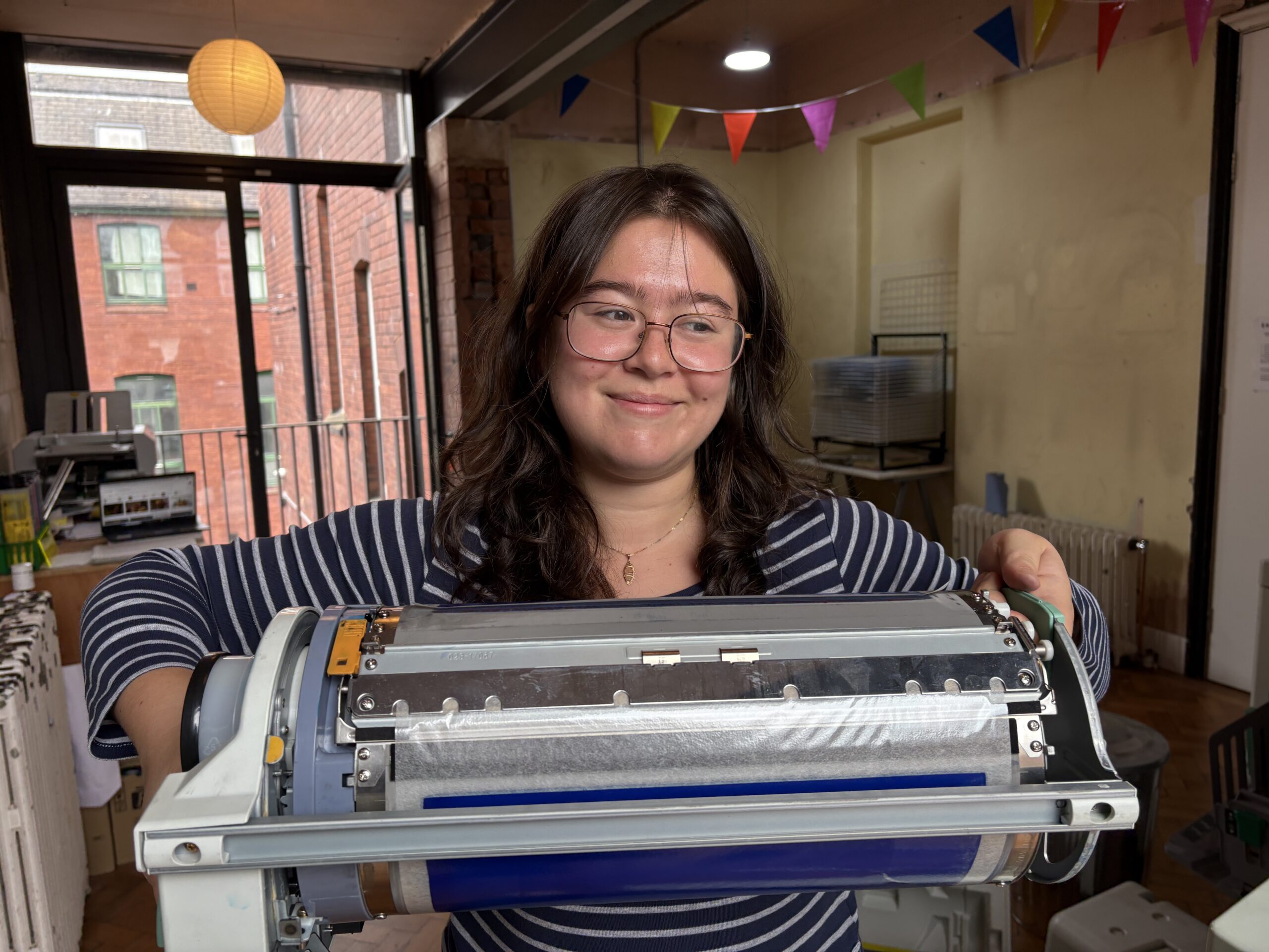
Annabel Cohen is an artist based in Leeds, interested in urban enviroments and traces of human activitiy.
How would you describe your practice, and what have you been working on in the Riso Room?
My practice explores photography, alternative processes and psychogeography. I’m drawn to belonging and mapping where I often work with personal archives and found material to bring playfulness to everyday life. I’m interested in the tactility of sustainable processes and re‑engaging people with hands‑on image‑making.
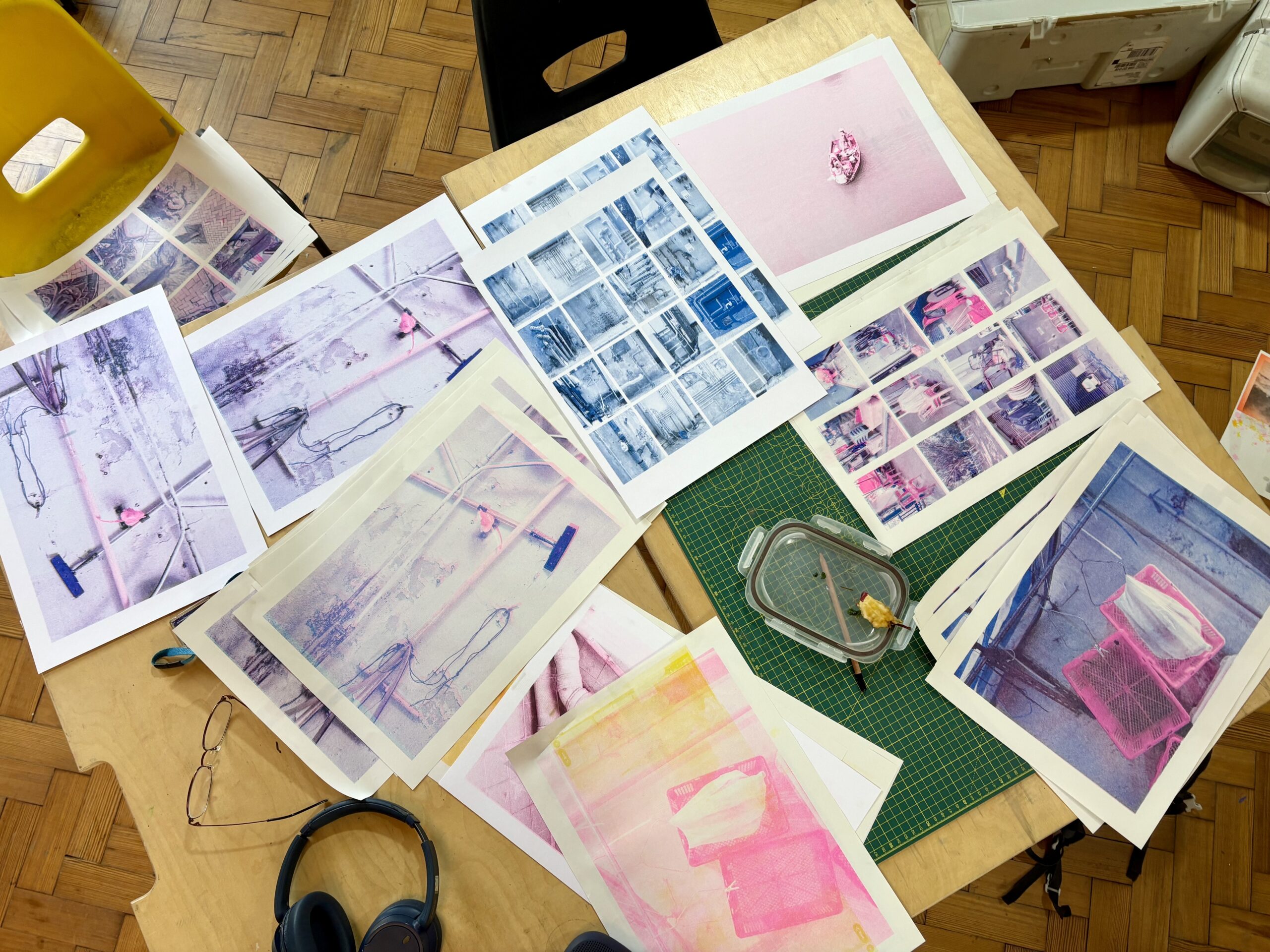
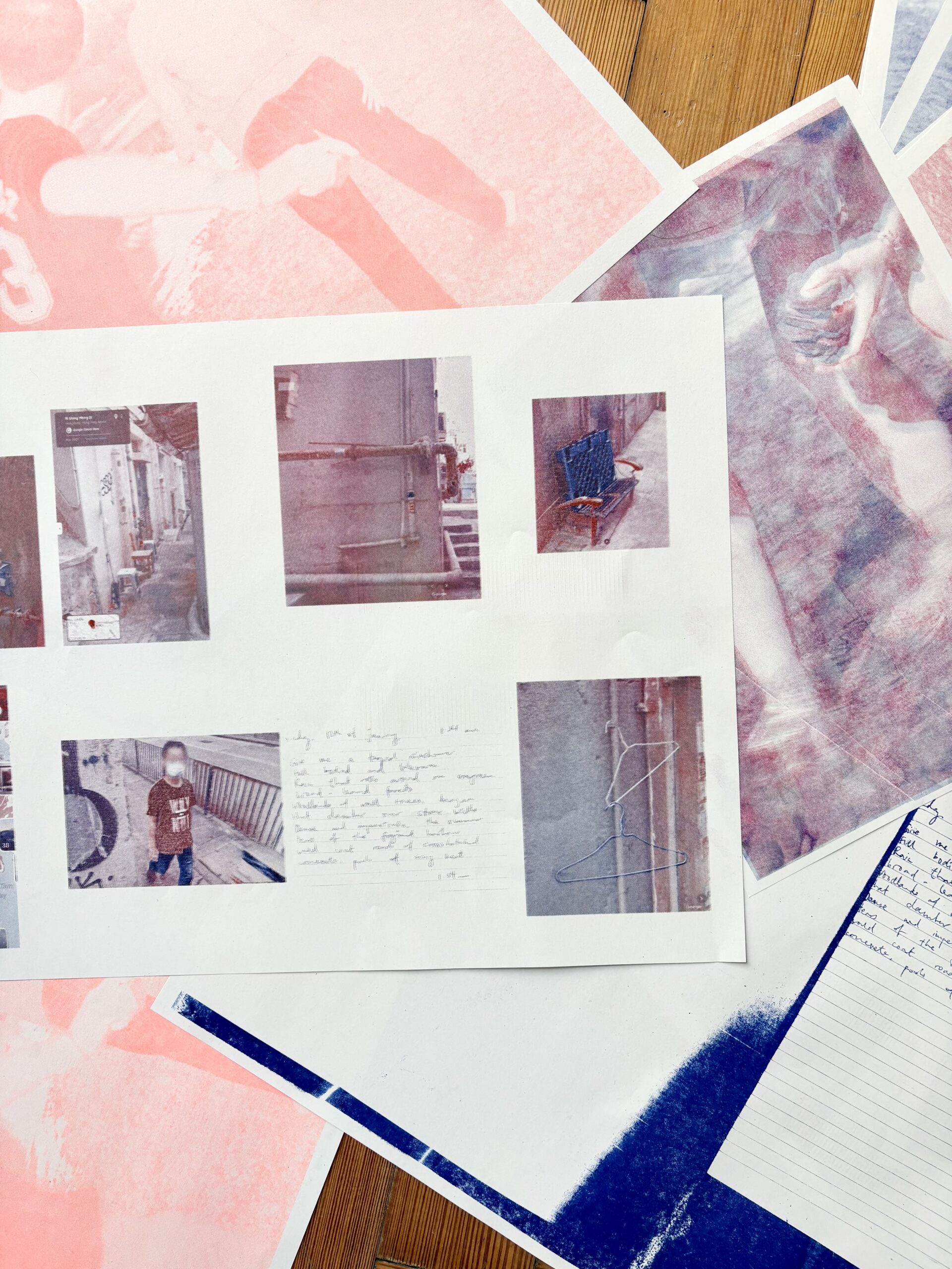
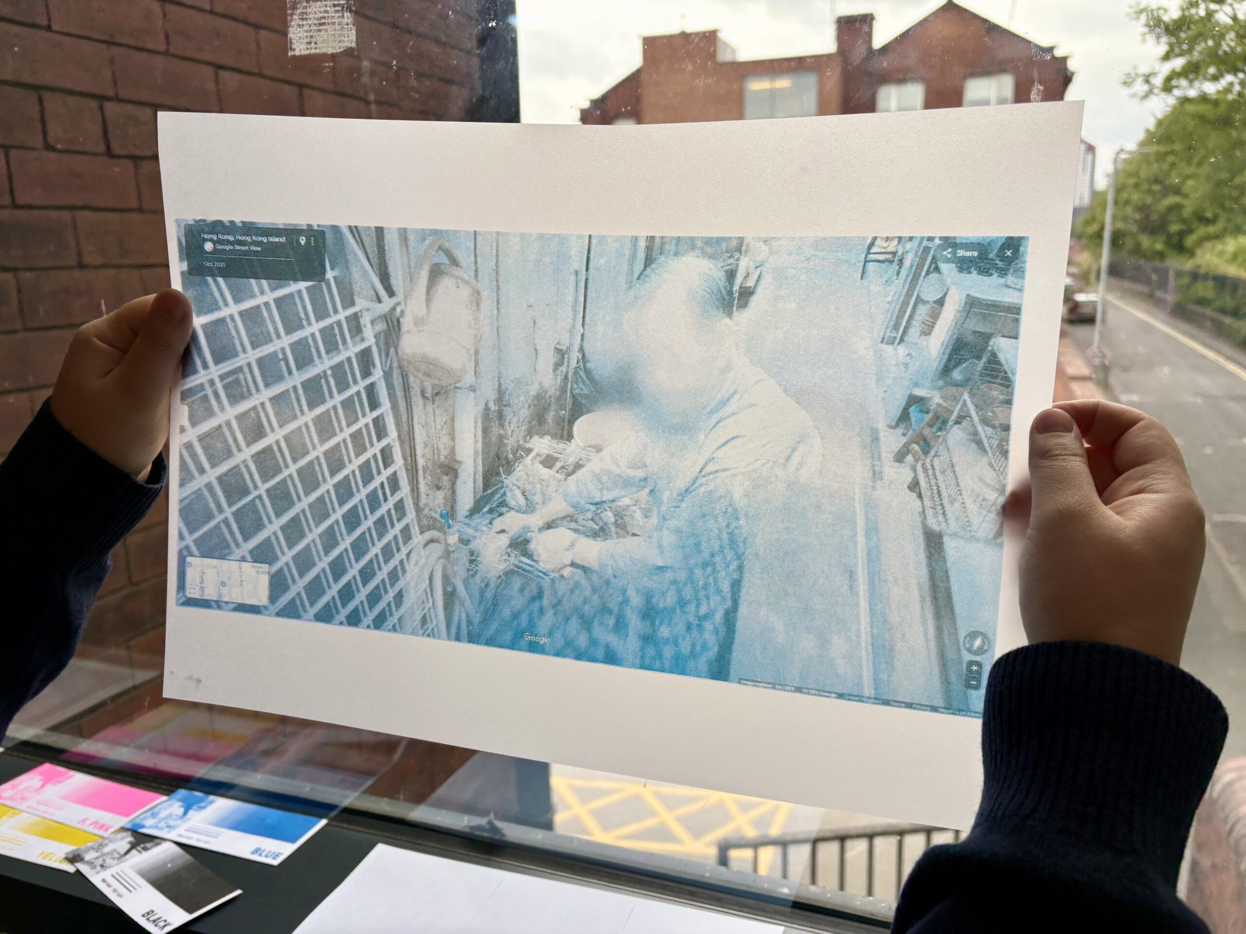
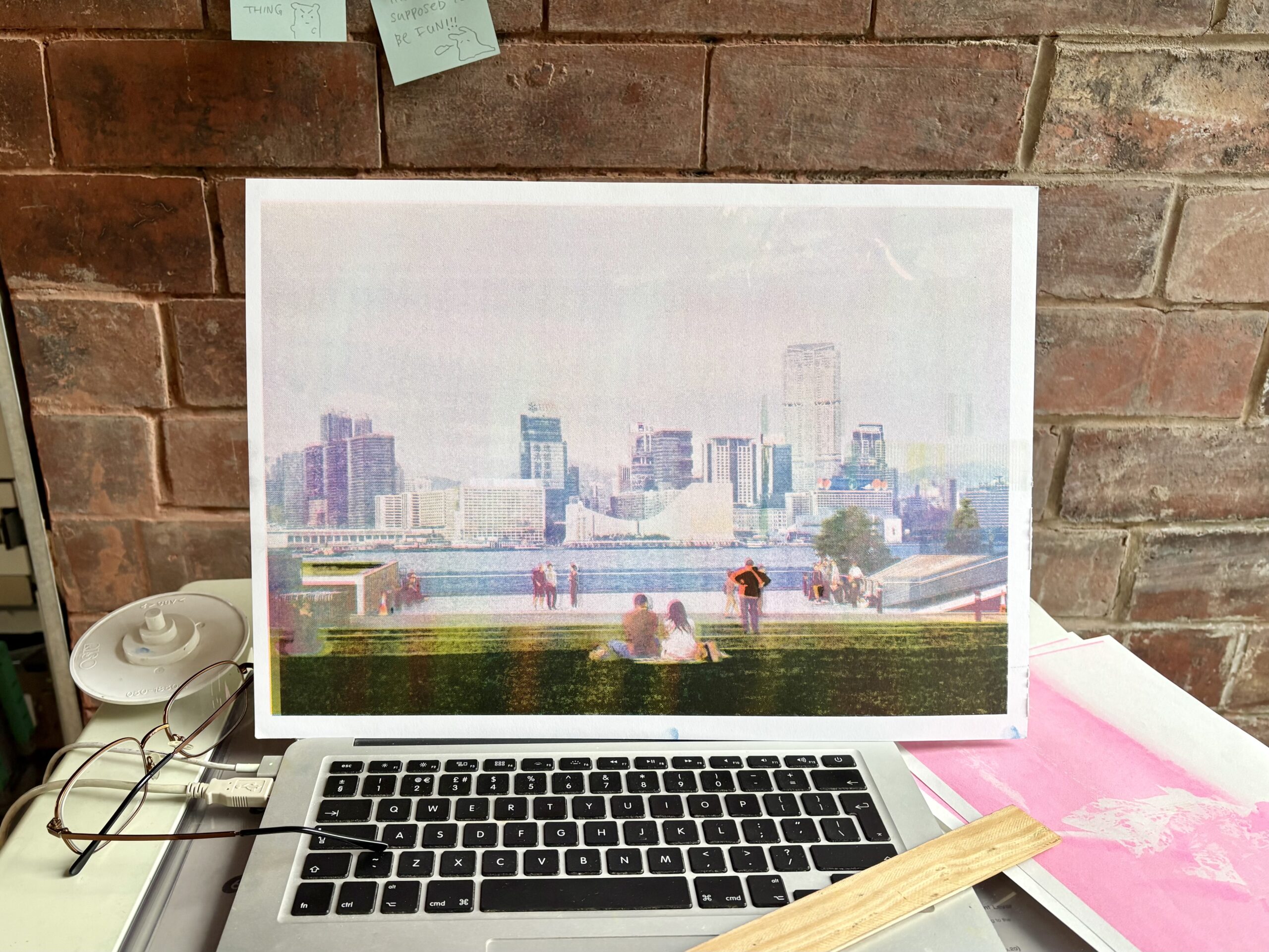
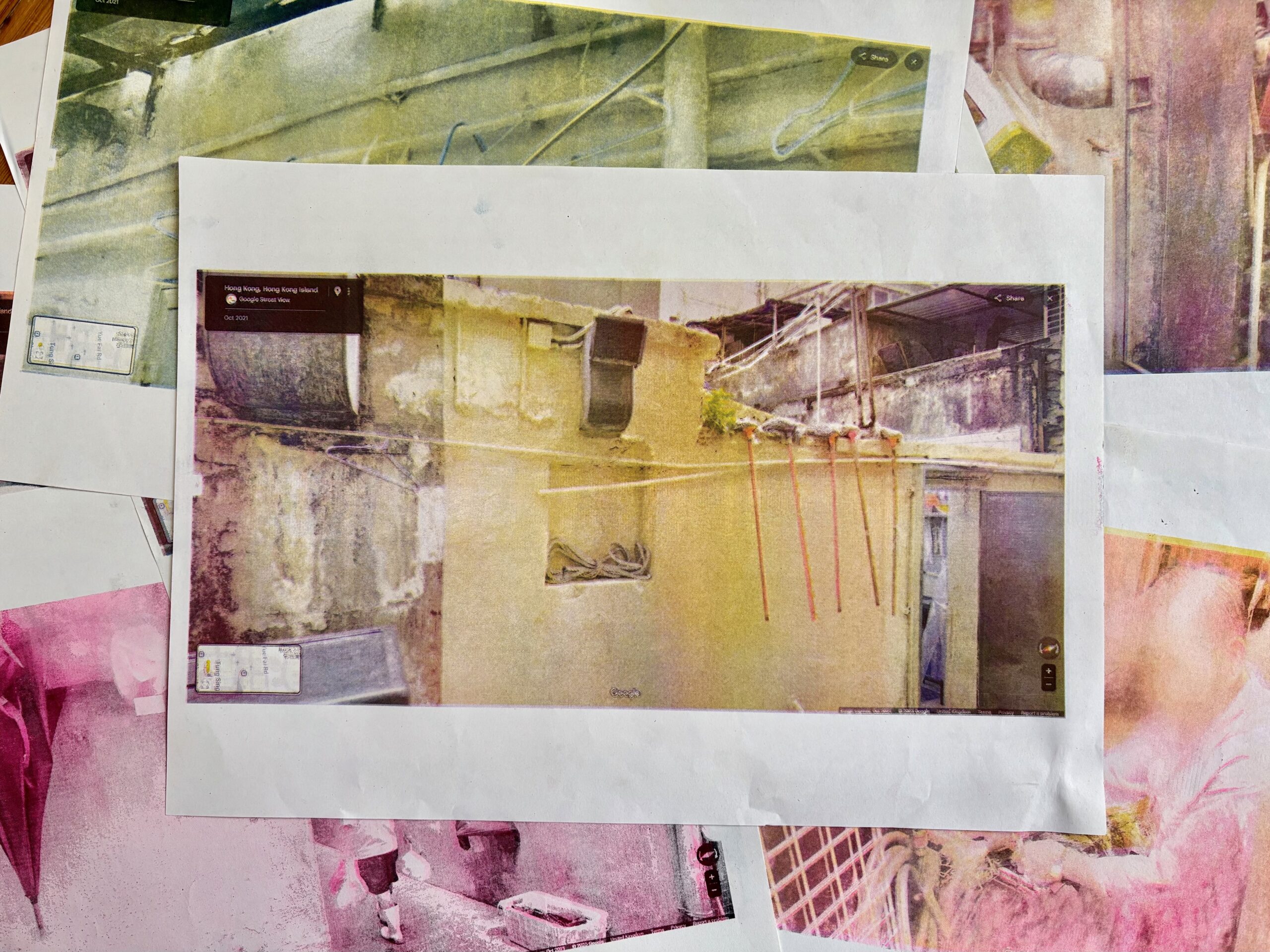
In the Riso Room, I focused on archival and personal photographs, particularly from Hong Kong, where I grew up. I explored ideas of walking, mapping and memory by grouping images with similar subject matter and experiences that I encountered in my wanderings. I also experimented with a digital walking tour using Google Maps, searching roads both familiar and not for images similar to my own. Alongside this, I tested a range of papers to see how each interacted with Riso ink.
Describe Riso printing in three words.
Fussy but beautiful.
Which part of the creative process in Riso printing inspires you the most?
The layering of the inks and the physicality of the prints is what inspires me most. Riso inks have such incredible hues. I love the way the ink sits on different papers creating tiny dot textures and unexpected shifts in the image, adding real depth to the print. Plus, the fact that the riso ink is made from rice bran oil really just makes me want to dive even deeper into sustainable inks and ways of working.
If you could only use two colours, what would they be and why?
Medium Blue because it’s a gorgeous colour. Orange because I never ran into any issues with it.
Has your time in the Risograph room changed how you work or think?
I’m used to slow, drawn‑out alternative processes, so having access to a machine that can produce multiple copies per minute was completely new. Riso encouraged me to work more impulsively and act on ideas quickly, learning and experimenting with a new skill and completely new function. It made me think differently about my images, especially in relation to each other. Seeing everyone else’s work in the exhibition also gave me loads of ideas, really showing how many different directions Riso can go.
What piece of advice would you give to someone who wants to start using Riso?
Stay open to anything. You learn so much from experimenting, troubleshooting and playing around and seeing how something goes.
Find Annabel:
Instagram: @flaneurbel_
Want to start riso printing?
